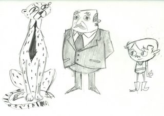
 Whoa! This is a big post! OK, so here's a quick look at the development of the cheetah's design over the years. Again, it goes from earliest drawings at the top (a couple of years ago), to more recent ones (a few weeks ago). It's only a small sampling, because it would be ridiculous to post the hundreds of drawings that I have.
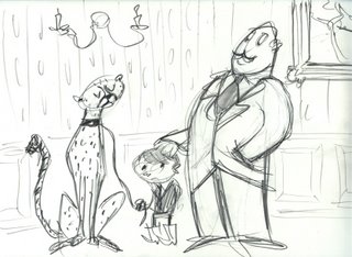 Suffice to say, the cheetah has been really tough to design. Maybe you're thinking that most of these drawings look the same, but to me there's a world of difference between each. I can draw a million times better than I could when I came up with the idea, so a lot of the early sketches are pretty bad. But every now and again I'd hit upon something charming, and I always look back and try to retain those qualities.
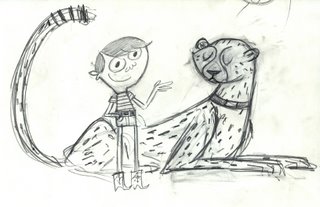 Another dilemma I have lies in the way I draw. I naturally draw really flat and growing up and throughout school I have been attracted to more flat, stylized designs. But recently within the last couple of years, I've begun to have a growing appreciation for more volumetric drawings trying to better my construction skills. And I'm realizing that the best stylized animation, like UPA, Tom Oreb, or Ed Benedict, is based on solid construction. So recently I've been trying to construct my drawings all the while trying to keep nice, graphic qualities. It certainly aint easy.
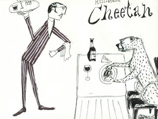
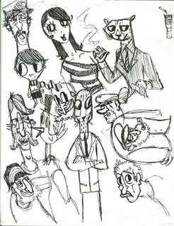 Man, these are bunch of weird doodles. Here's something interesting. Look at the above drawing, paying close attention to the dude in the bottom left corner. Now CLICK THIS. It's a drawing from a couple of months back. And look, there's even another cheetah to compare!
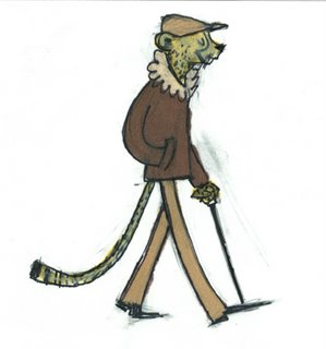 I really like this drawing.
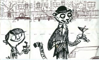 This is drawn on a white paper bag. I drew it while I was working at Roundtable Pizza. I didn't want to work there forever, so of course I snuck in some drawing time whenever I could.
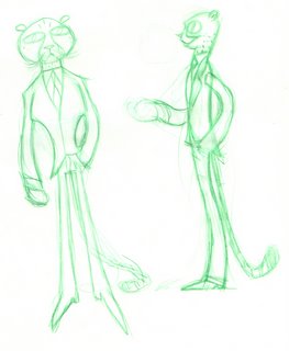 I don't like looking at these green ones, but they're part of the process.
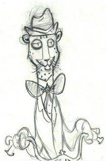
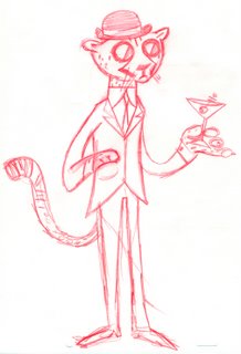
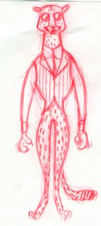 Pants, or no pants?
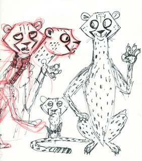 As weird as it may seem, these were some great breakthrough drawings for me.
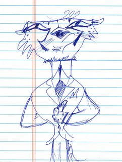 Here' s a doodle based off of some drawings Fred Osmond did for me. That's always a good way to get some new ideas, describe your character and ask a friend to interpret them.
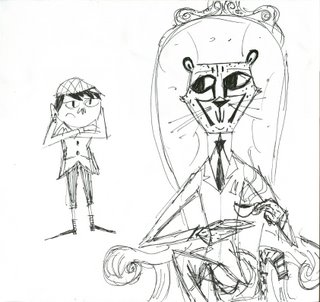 M. Sasek anyone? Oh how I love his books. He's a huge influence on me as well as this film. Also Ronald Searle!! I can't get enough!
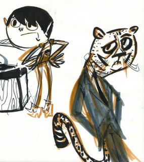 Another awesomely strange breakthrough drawing.
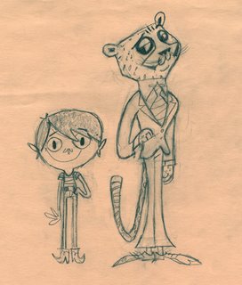 Now we're getting somewhere. I love this one.
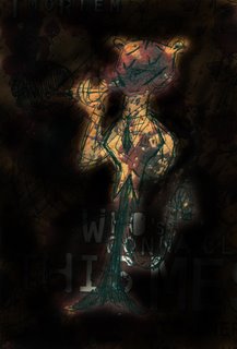 I hope you can make this out. It's a great scribble of a drawing on an LA Weekly.
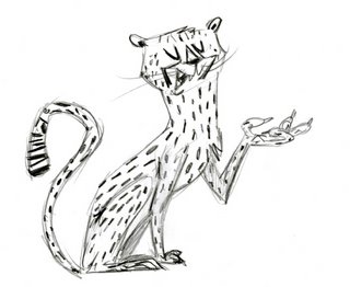 And finally the most recent versions. I only recently returned to the idea that he would be introduced as a regular cheetah, so it's been tricky trying to get a design that both works on four legs as well as two. I'll probably just cheat it anyways from scene to scene.
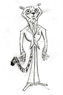 I guess I still haven't even touched upon trying to make the design look like an actual cheetah. That's a whole other issue. How cartoony do I want to go? Can I get away with a slightly different headshape than a real cheetah? Should I stay true to the animal? I mean, Chester Cheetah doesn't even look anything like a real cheetah, but people still buy it, right? But a cheetah's features and body shape are so distinct! I constantly ask myself these types of questions. I guess it's just part of the process. Oh yeah, and as for animating all those spots? We'll have to wait and see how that goes. But computers can make that sort of thing easier these days... hopefully.
Stay tuned for the development of the boy character, as well as the introduction (and soon tossed out idea) of the ghost of the human millionaire, based on the real-life Edward Gorey!
11 comments:
As far as animating the cheetah's spots goes, it might be cool if you just had a full-screen static bg layer of "cheetah texture" and then as the cheetah moves, his body has an alpha channel so you only see the bg texture that's behind him at that moment. Does that make sense? It might be distracting though.
Great post! It's educational seeing how your drawings and designs changed in two years - I'm trying to focus on my construction skills as well!
Wow, that's a lotta development sketches...which is good for us! These are great, I love how the characters are evolving (and I agree with Marc about the "static cheetah texture" idea, it'd be really cool!
hey whats up! your cheetah stuff looks awesome, thats a hilarious idea by the way. i can't wait to see more stuff about him. :)
Thanks everyone!
Marc-Yeah, I've thought about using that technique before. I remember Dave Wasson used it on a turtle shell in one of his Oh Yeah shorts a while back, but I believe it was done traditionally. I kinda think it would be distracting though, but I'll have to do some tests. And when I get to that, I'll definetely post them.
Wow, this is some really amazing stuff!
The breakthrough drawings are definately the coolest, to me. You found something new in each one!
keep rockin.
Nice stuff! Expressive and fun drawings. Can't wait to see more of your progress on the film.
Thanks Josh, Jim, and Amid! Your kind words keep me going!
holy cow dude
awesome progression. great designs.
I really enjoy the top character in the suit, really nice design.
Post a Comment